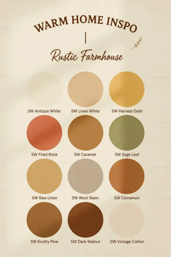
You’ve picked a warm cozy paint color, you’ve rolled it onto the walls, and now you’re staring at a room that feels like it’s closing in on you. Maybe it’s too heavy, maybe it’s got a weird yellow glow that makes your white trim look dingy, but either way, it’s not the calm, snug hideaway you saw on Pinterest. The internet told you to go warm, and you did, so why does your living room feel annoying instead of relaxing?
Honestly, the biggest mistake I see with warm cozy paint colors is that people rush to the darkest or most golden swatch on the card, assuming more pigment means more comfort. But real hygge isn’t about turning your home into a cave or a butter factory. It’s about balance, softness, and light that feels natural, not theatrical. So before you buy that gallon of deep terracotta or mustard gold, let me save you some money and a headache.
The Mistake: Going Too Dark, Too Yellow, or Both
There’s a weird pressure to make warm rooms feel intense, like if the walls aren’t screaming “amber” or “cocoa,” they’ve somehow failed their cozy duty. But here’s the thing: excessively dark warm tones absorb light in a way that makes a space feel smaller, heavier, and honestly a bit suffocating by late afternoon. Look, I love a moody room as much as the next person, but there’s a huge difference between “moody” and “the walls are closing in.”
Then you have the yellow trap. A shade with too much yellow in it doesn’t just look like sunshine, it starts to look like an old kitchen, the kind with grease stains that never quite come out of the upper cabinets. It reflects onto your skin, making everyone look a little jaundiced, and it can make your carefully curated neutral furniture look like it has a weird stain on it.
So what’s the actual fix? Stop looking at the darkest chip in the warm row. Instead, look at the muted, slightly grayed-out cousins in the same family.
What “Warm Cozy” Actually Means (Hint: It’s Not Yellow)
I’m going to say something that might get me in trouble, but a lot of greige and beige paints marketed as “greige” are just muddy browns that read as dirty on the wall. The magic of a true warm cozy paint color lies in its ability to sit quietly in the background. You want a color that wraps the room in a soft hug, but doesn’t scream for attention every time you walk past the doorway.
Muted earthy tones with a hint of gray are the secret. Think of a warm putty, a dusty clay, or a soft sage that leans slightly brown. These shades have a groundedness to them that flat-out yellow or orange don’t have. They hold onto the warmth without the aggressive saturation that makes a space feel heavy and off.
Now, I know what you’re thinking, how do you find these mythical shades without breaking the bank on samples? Easy. You buy the sample pots, yes, but you test them on a giant piece of white foam board, not directly on the wall. That way, you can move the board around the room during the day to see how the light hits it. It’s like a second opinion that costs less than a latte.
Budget-Friendly Warm Paint: 3 Real, Affordable Options
Not everyone can drop $70 a gallon on designer paint, and you shouldn’t have to. Here’s the thing, the expensive stuff is often about the finish and coverage, but the color itself can be matched by any hardware store. So here are three wallet-friendly choices that I’ve seen do wonders, and they won’t wreck your weekend budget:
- Sherwin-Williams (sold at Lowe’s) in “Accessible Beige”: This is the poster child for muted warmth. It has that gray undertone that keeps it from going yellow, and it makes furniture look expensive.
- Behr (at Home Depot) in “Campfire Ash”: It’s a weird name, but it’s a fantastic soft, dusty brown with a hint of rose. It doesn’t read pink, it just reads calm. Such a sleeper hit.
- Deep discounts on mis-tinted paint: Seriously, check the clearance rack. People return paint over lighting regrets all the time. I once found a gallon of a perfect warm greige for $9, and it’s still my favorite wall in the house. You just have to be open to whatever is there.
And there is no rule saying you have to paint all four walls. If you’re scared of commitment, paint one accent wall in a muted earthy tone and leave the rest a warm white. It gives that cozy dopamine hit without feeling like you’re living in a burlap sack. This is also a great way to go if your budget only stretches to one gallon; that’s fine, we work with what we’ve got.
How Undertones Control the Whole Budget Vibe
Look, the quickest way to look like you have no money is to buy paint that fights your flooring or your sofa. You want the whole room to feel like it flows, and the paint is the free-flowing river that ties it all together. A paint with a green undertone will make a red-toned wood floor look amazing, but a paint with an orange undertone on the same floor will just look like a clash.
So, when you’re staring at those swatches in the store, do yourself a favor and hold them up against a plain white piece of paper. That will help you see the true undertone. If the swatch looks slightly purple, it’s not warm, it’s cool. If it looks like a banana, it’s too yellow. You want that sweet spot, the one that looks almost gray until you see it next to a true gray. Then, and only then, does its warmth reveal itself.
It sounds technical, but really it’s just about observation. And honestly, it’s a hell of a lot cheaper to make a mistake on a swatch card than it is on 400 square feet of drywall. I have a friend who painted her entire living room a “soft ochre” that ended up looking like a highlighter, and she had to hire a painter to fix it. Don’t be that person. You save money by being smart, not by being lucky.
Test Before You Invest: The Big Board Trick
Okay, so I mentioned this earlier, but I need to drive it home because it’s the difference between a win and a disaster. You paint a sample onto a 2-foot by 3-foot foam board, lean it against the wall, and leave it for 48 hours. You have to look at it in the morning, in the harsh noon sun, in the dim evening lamp light, and maybe even with a cup of coffee in your hand pretending you’re reading a book there. This is the only way to know if the color will actually feel cozy.
Don’t just paint a small square on the drywall either. Paint covers the wall differently than it covers a board, and you’ll get a false sense of the color. The board is non-porous, so it gives you a more accurate, uniform read of the pigment. I learned this from a professional painter who fixed my first disastrous attempt at painting a hallway. He looked at my tiny painted patch and just laughed, shaking his head. That’s a humbling moment, let me tell you.
It’s a little bit of a pain, but it’s so much better than the alternative. I’ve stood in the paint aisle at 9 p.m. after a long day, staring at a wall I just painted, questioning all my life choices. That, my friend, is the true cost of skipping the test stage. It’s a mental toll. You avoid that by paying for an extra sample pot. That’s a bargain at twice the price, honestly.
What To Do With Your Current “Wrong” Color
So you already painted your wall top to bottom and you hate it. You’re looking at the wall thinking, “well, I just wasted my money.” Hey, I’ve been there, we’ve all been there. But before you rush out to buy all new paint, there’s a cheap trick that might actually save what you have. You can glaze over it. A tinted glaze or a simple matte topcoat in a slightly lighter, grayer tone can take the edge off a too-yellow wall.
It sounds crazy, but it’s a thing. You apply a semi-transparent layer of white or gray paint mixed with glaze, and it just tonifies the color underneath, like adding a filter to your walls. It’s a really affordable way to fix the problem, actually, because glaze is cheap and you can just use some leftover white paint you already have in the garage. It won’t completely change the color, but it will mute the saturation and pull back the heat.
If the color is truly beyond saving, just paint over it with a flat primer first. And I mean a proper primer, not that expensive paint-and-primer-in-one nonsense. A coat of good primer is cheaper than a second coat of color, and it will give you a clean base so the new, more muted color actually looks like it’s supposed to. It’s a little more elbow grease, but your wall won’t fight you.
So here’s the deal: choose a warm cozy paint color that whispers, not shouts. Look for that muted earthy tone, the one with a hint of gray, the one that just feels “right” when you look at it without trying to talk yourself into it. Your space should feel calm, and the color should be the background music to your life, not the lead singer screaming into the mic.
Take a breath, grab a few sample pots in those softer shades, and give it a week to sit with you. You might be surprised by how much calmer a quieter wall can make you feel. And if you’re still stuck, just copy this one simple rule, go one shade lighter and one step less yellow than your first instinct. You can thank me later. Now go find that perfect, wallet-friendly hue, and make your home feel like a warm hug.
Leave a Comment