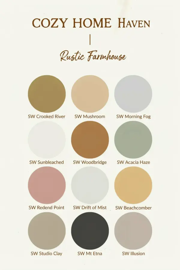
Walking in from a bitter cold evening, you kick off your boots and drop your keys. The room wraps around you, and for a second, the wind outside feels like a distant memory. That feeling of relief, of being swaddled by your own space, is not just about a warm blanket or a crackling candle. It is largely about color. Warm cozy paint colors are the quietest way to change how a room makes you feel, turning a stark winter landscape outside into a gentle sanctuary inside.
Warm Paint Colors vs. Cool Paint Colors: A Beginner’s Guide
If you have never chosen a paint color based on its temperature, don’t worry. It sounds more complicated than it is. Every color has an undertone, a subtle hint of its base pigment. Warm colors lean toward yellow, orange, or red. They feel like sunlight, toast, and wool sweaters. Cool colors lean toward blue, green, or violet, which can feel crisp but sometimes a little stark when the sky is already grey for weeks.
For a winter scheme, you want to invite the feeling of brightness and softness inward. You are not just decorating a wall; you are building a daily ritual of comfort. When you start looking at paint swatches, hold them up against a white sheet of paper. If the swatch appears slightly buttery or pinkish, it is probably warm. If it appears slatey or icy, it is cool. This simple test will guide you through every single decision.
Why Creamy Oatmeal and Soft Beige Make Rooms Feel Like a Hug
There is a reason so many people gravitate toward a creamy oatmeal shade for their living rooms. These colors act like a canvas that doesn’t shout but gently hums. They have depth, unlike stark white which often feels clinical or glaring under low winter light. A warm off-white or beige picks up the glow from lamps and candlelight, bouncing it evenly around the room.
These neutral backdrops are perfect if you are afraid of color. They are forgiving with furniture and practically foolproof. Consider trying a shade like Benjamin Moore’s Simply White if you need a true clean look, or look for terms like “wheat,” “sand,” or “latte” on the chip. They create a seamless base that makes your knit throws and wood furniture pop without any visual effort.
- They make small spaces feel bigger while maintaining warmth.
- They hide everyday dust and scuffs much better than pure white.
- They provide a neutral base that lets you change decor with the seasons easily.
Warm Terracotta Paint Colors for a Lively but Relaxed Room
If you want a touch of adventure but still want to feel like you are being swaddled, terracotta is your sweet spot. This is the color of baked clay, dried autumn leaves, and rustic pottery. It has the warmth of red but the earthiness of brown, which prevents it from feeling aggressive or overstimulating. It is a lovely choice for a dining room where you want digestible energy or a reading nook where you want to feel rooted.
Terracotta changes beautifully as your day progresses. In the morning, it looks fresh and zesty. By the evening, under dimmed lighting, it turns into a rich, enveloping tone that makes you want to curl up and stay a while. It pairs gorgeously with natural wood tones, cream linens, and even touches of deep forest green if you want a more curated, moody look.
Moody Olive Green Paint Colors for a Cocooning and Grounded Winter
Do not let the phrase “dark paint” scare you. A moody olive green is not about making a room feel like a cave. It is about bringing the outdoors in, at a time when the outdoors is sleeping. Green is a natural stress reliever, and when it is muted with grey and brown to make olive, it feels incredibly sophisticated and snug. It mimics the evergreen boughs and pine needles of the holiday season.
This works wonderfully in a bedroom or a cozy den. Painting walls in olive creates a strong contrast against cream colored bedding or a soft white throw blanket. It makes those textures look even more luxurious. If you are hesitant to do an entire room, use it on a single accent wall behind your bed or sofa. You will get the depth and comfort without the commitment, and it will ground the entire room’s color palette.
How to Select a Shade Based on Your Room’s Natural Light
Have you ever noticed that the same paint color looks totally different in two houses? That is because light dictates everything. A north facing room gets cool, steady daylight, so your warm colors might look a little flatter here. You will need to lean into richer, more medium-toned shades like a honeyed caramel or a deep terracotta to feel the effect. Stronger pigment actually fights the lack of direct sun.
In a south facing room that gets glowing yellow light most of the day, you have more freedom. You can use lighter oatmeal shades and they will look golden and radiant. A west facing room gets dramatic sunset light, so you could experiment with a moody olive or a warm greige that shifts in the evening. Always buy a sample pot and paint a large piece of foam board. Move it around the room for a few days, from morning to night, before you make the final call.
Playful and Practical Accent Colors for the Right Type of Space
We often overlook small areas like powder rooms, mudrooms, or the back of a bookshelf. These tiny spaces are perfect for a second helping of cozy. Instead of a loud or acidic tone, choose a warm dusty rose or a soft dried apricot. Seeing a room in a vibrant splash of warm color never feels as risky as you imagine. It becomes a cheerful little moment you discover every time you pass by.
For your main living spaces, you can use a hygge home philosophy. Layer your colors just like you layer your textiles. Think of your walls as the base blanket, your furniture as the throw, and your accessories as the tiny decorative pillows. Your base does not need to be the most interesting part; it just needs to hold everything else comfortably. By using these specific colors, you are literally wrapping your architecture in warmth, making your whole home feel safer during those long winter months.
Finishing Touches: Pairing Textures with a Cozy Paint Palette
A room is never complete with just paint. To achieve that full “hug” effect, you need to bridge the gap between what you see and what you touch. Faux fur cushions, a chunky chunky knit blanket, velvet curtains, and a wool rug all work with the walls to create an ecosystem of rest. When the visual temperatures of your paint and physical temperatures of your textures match, the room feels harmonized.
Be intentional with your lighting too. Overhead lighting can feel harsh, even in a perfectly painted terracotta room. Use table lamps and candles so the light source is low and horizontal. The warm glow from these bulbs will enhance the warmth in your paint. Before you know it, every evening will feel like a mini retreat from the cold outside, simply because you planned your surfaces thoughtfully.
Choosing winter decor that focuses on paint is a smart investment. It is a permanent backdrop that costs less than a new sofa and changes the entire spirit of your home. Look at your walls through fresh eyes this season, and see what story they are telling you. Whether you want the quiet security of oatmeal or the bold earthiness of terracotta, your perfect shade is out there waiting to meet you.
Have you been thinking about a color change for the cold months? Which of these palettes feels most like your ideal night in? Tell me in the comments below, and as always, happy painting!
Leave a Comment