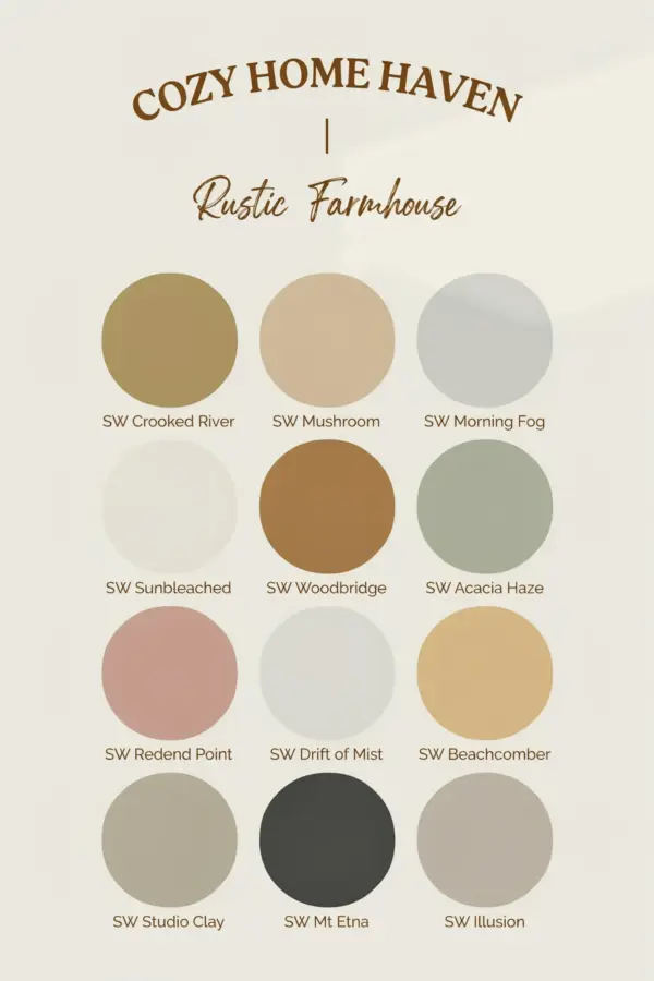
Mistake 1: Choosing Paint Colors with the Wrong Undertones
Many people assume any beige or gray will feel warm. But the undertone is everything in hygge decor. A taupe or greige that leans blue or green can make a room feel sterile and cold. That is the opposite of a cozy home haven. Warm cozy paint colors should have subtle red, yellow, or orange undertones. Think of a soft greige like Benjamin Moore’s Edgecomb Gray, which has a gentle yellow base. Or a muted taupe with pink warmth. When you hold paint strips next to a pure white or a true gray, the undertone becomes obvious. Always compare samples against natural light before you commit.
Mistake 2: Ignoring Your Room’s Natural Lighting
The same paint color looks completely different in a north facing room versus a south facing one. North light is cool and gray, which can wash out warm tones. If your room gets mainly northern light, you need a warmer version of your chosen hue. A soft terracotta or a greige with a noticeable tan base will keep the space from feeling flat. South facing rooms can handle slightly cooler warm tones, like a muted linen or a light mushroom. Here are a few lighting tips to avoid disappointment:
- Test paint on multiple walls. Observe at noon and at dusk.
- Use large sample boards (at least 12×12 inches) to see how light moves across the color.
- For rooms with dark corners, choose a color that reads warm even in shadow. A mid-tone warm paint often works better than a pale one.
It is better to go a shade warmer than you think you need. Your eyes will thank you on a rainy afternoon.
Mistake 3: Going Too Dark or Too Light for Hygge
Hygge is about soft, enveloping comfort, not drama. Painting a small room a very dark brown or charcoal can feel oppressive instead of cozy. On the other hand, a stark white or pale ice blue will never create that hug like atmosphere. The sweet spot is medium to deep muted tones. Think of a warm mushroom, a dusty rose, or a rich oatmeal. These colors absorb light gently and make the walls feel like they are wrapping around you. If you love a darker shade, use it on a single accent wall and keep the other walls a lighter version of the same hue. This keeps the room grounded but breathable. For a true cozy home haven, avoid extremes. Stay within the middle range of the color strip.
Mistake 4: Forgetting to Coordinate Your Trim and Ceiling
One of the most common mistakes I see is painting walls a beautiful warm taupe but leaving the trim a stark bright white. That high contrast breaks the calm flow of a hygge space. Instead, choose a trim color that is only slightly lighter than the wall color. A warm off white with a hint of cream or a soft greige works beautifully. For ceilings, consider painting them the same color as the walls but one or two shades lighter. This technique, often called color drenching, blurs the edges of the room and makes the space feel larger and more cocooning. It is a simple shift that avoids visual interruptions. Your eye can then rest without jumping from wall to trim to ceiling.
Leave a Comment