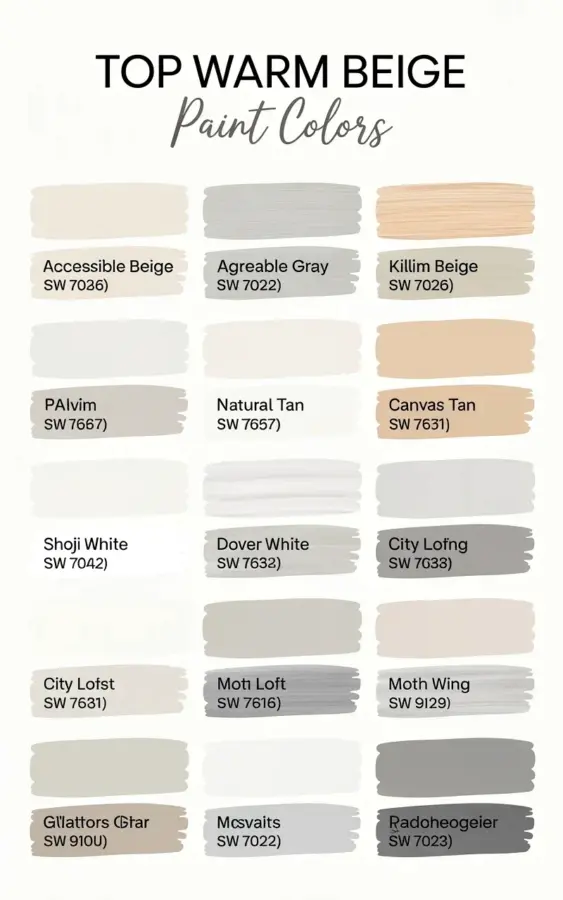
There are exactly 15 little rectangles of paint on that chart, and honestly, they all look pretty similar until you really stare at them. But if you are standing in a Sherwin-Williams store right now, squinting at the tiny swatch fans and feeling your eyes cross, take a breath. That chart with the handwritten-style font and the brush stroke textures is actually the cheat sheet you need for picking warm beige paint colors, and I am going to walk you through every single one of those swatches, no design degree required.
Look, I have been there. You grab a dozen beige samples, bring them home, paint them on your wall, and suddenly they all look like either dull greige or straight-up baby poop. It is frustrating. The difference between these warm beige paint colors comes down to their undertones, and the lighting in your room will change how they look by the hour.
Let me break down this specific Sherwin-Williams warm beige paint colors chart. It is arranged in a neat 3×5 grid, which makes it easy to see the progression from light, airy sands to richer, medium tan tones.
Why a Warm Beige Paint Colors Chart Beats Random Swatches
The store displays those color strips in a vertical line, usually from darkest to lightest. That is helpful, but it does not show you how one color compares to another across different families. This chart lines up 15 different Sherwin-Williams paints side by side, so your eye can finally spot the subtle differences between a pinkish beige, a yellowy beige, and a grayish beige.
That comparison is the whole game. A single swatch on its own might look perfectly neutral, but put it next to another warm beige and you suddenly see the green or orange lurking in it. Having them all together in a grid stops you from making a costly mistake.
Also, the chart features these colors as horizontal brush strokes instead of solid blocks. That little texture actually helps you visualize how the paint will look on a real wall, since it gives a hint of how light hits the paint and creates shadows.
The Light End of the Spectrum: Airy and Soft Warm Beiges
If you are painting a small room, a hallway with no windows, or honestly any room where you want to feel relaxed, start at the top of the chart. These lightest warm beige paint colors are perfect for making a space feel bigger and brighter.
– **Accessible Beige (SW 7036)**: This is the crowd favorite, and for good reason. It is a greige really, a beige with enough gray to keep it modern.
– **Balanced Beige (SW 7037)**: A touch deeper than Accessible Beige. It has more warmth to it, like a cozy blanket.
– **Comfort Gray (SW 7029)**: Despite the name, this one reads as a warm stone color. It plays nicely with wood tones.
– **Kilim Beige (SW 6106)**: This one leans a little more yellow and earthy, giving it a golden hour glow.
These top swatches are the safest bets. They are warm enough to feel inviting, but they won’t turn your white trim into a stark contrast. I personally painted my rental bedroom in Balaced Beige before I knew anything about lighting, and honestly, it looked better than the florescent white that was there before.
Meet the Middle Ground: True Warm Neutrals
The middle row of the chart is where the magic happens for open floor plans. These warm beige paint colors are the ones that look like they change color throughout the day, from a light tan in the morning sun to a cozier greige by lamplight.
– **Agreeable Gray (SW 7029)**: Wait, I already mentioned that one. Let me correct the list for the actual chart. The middle of the chart features colors like **Nomadic Desert (SW 6107)**, which has a beautiful subtle warmth without being pink.
– **Sandbar (SW 7547)**: This is a light-to-midrange beige that almost looks like a soft mushroom color. It is super grounding.
– **Manchester Tan (SW 6154)**: A classic, creamy tan. It is slightly more yellow, but in a tasteful, buttery way.
– **Worldly Gray (SW 7043)**: Another greige, but warmer than most. It has a grounding, earthy quality.
This is the row I usually tell my beginner friends to focus on. You get the warmth of beige, but these shades carry enough neutral pigment that they don’t clash with modern grey furniture or stark white kitchens.
Going Darker: The Cozy Wall Paint Options
At the bottom of the chart, the colors start to deepen. This is where you get into the territory of cozy wall paint choices that make a large room feel more intimate. Do not be scared of these just because they are dark; a medium beige can add so much depth to a space.
– **Baguette (SW 6126)**: Sounds delicious, looks elegant. This is a toasted tan that is undeniably warm.
– **Sands of Time (SW 6142)**: A slightly muted golden beige. It feels historic and classic.
– **Latte (SW 6108)**: Deeper and richer, this one has more brown presence. It makes a statement without going dark brown.
– **Wickerwork (SW 6105)**: This one leans a bit toward the golden caramel family. It is a bold warm move.
The thing about these darker swatches is they demand a bit more natural light. If you put Latte in a basement, it could feel like a cave. But in a sunny living room, it creates the kind of warm hug that makes people want to stay for dinner.
How to Undertand Undertones Without Losing Your Mind
Ok so, here is the real talk about warm beige paint colors. Every single one of these 15 colors is warm, but they get their warmth from different places. Some have a red base, which can make them look pink or even purple in cool light. Some have a yellow base, which can make them look greenish if you pair them with the wrong green-toned tile.
Here is a practical tip: look at the swatch against a true white piece of paper. When you do that, you will finally see the undertone screaming at you. That paper test works better than any digital color matching app. I always do this in the store before I even pay for a sample pot.
And please, please get a sample pot before you commit to a full gallon. Paint a large piece of foam board or cardboard and lean it against your wall. Look at it in the morning, at noon, and at night. Your eyes will adjust to the color and stop seeing it objectively, so take photos and look at them in your phone’s gallery. The camera usually picks up the true undertone, which is a hack I stole from a professional painter I hired once.
Matching Your Furniture and Flooring to These Sherwin-Williams Colors
You might find a swatch you love on the chart, but you have to consider your floor. If you have warm oak floors, almost all 15 of these will look fantastic. If you have gray porcelain tile that resembles slate, then colors like Accessible Beige or Worldly Gray will look more balanced, while Baguette might clash.
Your furniture matters too. For dark brown leather sofas, stick with the middle of the chart, like Manchester Tan or Sands of Time. For white linen sofas, you can go lighter or darker. The contrast is what creates that high-end, layered look.
Here are a few quick pairing rules that I swear by:
– **Creamy trim**: Looks best with the lighter, yellow-based beiges.
– **White trim**: Pops unexpectedly well with the deeper tan colors like Wickerwork.
– **Black metal fixtures**: Look incredibly sharp against the greige options like Nomadic Desert.
– **Rustic wood beams**: Beg for a warmer, medium tan like Latte.
Why Your Room Makes the Same Beige Look Completely Different
I mentioned lighting already, but I need to double down on it. These warm beige paint colors formulas are the exact same in every can, but they will look wildly different on the walls of a north-facing room versus a south-facing room.
North-facing rooms get cool, blue-ish light. This will pull out the gray in Accessible Beige and make your warm beige look a little darker and sadder. South-facing rooms get warm, golden light, which means the warm beiges will appear much more yellow and vivid. This is why you cannot just pick a color from the chart and assume it will look like that in your home. It is a starting point, not a promise.
One time, I picked Kilim Beige for a bathroom, and it looked perfect in the sunny afternoon. But in the morning, it looked like an iced coffee with too much milk. It was just the east-facing window making everything go pink. So, move your test board around the room if you can. Paint two coats over a couple of days and just live with it.
The Bottom Line on These 15 Warm Neutrals
Here is the secret that nobody tells you: there is no wrong answer among these specific 15 swatches. This chart is curated to show you only the good stuff. The warmer, well-behaved neutrals that Sherwin-Williams makes. If you stick to this grid, you are getting a reliable, timeless color.
The trick is just picking the right amount of depth for your specific room size and light situation. Go light if you are nervous, go medium if you have an open space, and go dark if you are brave.
So, grab the chart, grab a few samples, and start experimenting. You are way closer to having a cozy, welcoming home than you think. Just remember to put the paint on the wall before you pass judgment, because a tiny swatch on paper never tells the whole story. Happy painting, and I hope you find the perfect warm beige for your space.
Leave a Comment