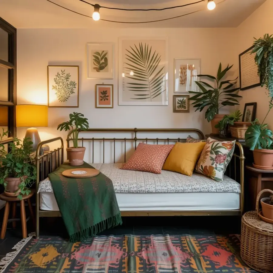
Let me guess. You have been collecting patterned pillows for months. A Moroccan trellis here, an Aztec zigzag there, and that paisley duvet you found at a flea market. It looks bold in the cart, but in your bedroom? Honestly, it feels like a circus exploded. The biggest bohemian bedroom mistake is piling on too many wild patterns without any anchor, and this post is going to show you exactly how to fix that. See how the vintage metal daybed in the photo grounds the whole look with a simple white mattress and neutral pillow base. Then those pops of coral, mustard and florals feel intentional, not chaotic. I have made this mistake myself. I once bought a vintage kilim rug and then tried to match it with a floral tapestry and a geometric headboard. My room looked like a textile yard sale. Here is what I learned: save yourself the headache and let one piece shine.
Why a vintage metal daybed is the perfect anchor for a boho bedroom
Look, a metal daybed does something magical. It provides structure without shouting. The slim black or white frame gives your eye a place to rest. It is a quiet, solid silhouette in the middle of all that texture and color. Ok so, the photo shows a vintage metal daybed with a white mattress and a gray and white patterned cover. That cover is the only repeating pattern on the bed base itself. Everything else, the coral polka dot pillow, the mustard yellow one, the floral print, they sit on top like guests at a dinner party. The daybed is the host. Not gonna lie, I used to think boho meant more is more. But the daybed teaches you restraint. It forces you to pick a starting point. Without it, your eye wanders and gets tired. With it, you have a visual home base.
Start with a neutral base before you add any pattern
Here is the concrete step. Buy a white or cream mattress cover. Or a simple gray and white patterned one like in the photo. That is your canvas. Then add a neutral throw, maybe a soft beige or taupe. Then, and only then, bring in the punchy pillows. I cannot stress this enough. I once tried to layer a bright yellow duvet with a multicolored quilt. It looked like a clown car. Everything competed. The white base in the photo lets the coral polka dots and the floral print breathe. Think of it like this:
- One neutral foundation: white mattress, gray patterned cover, or a solid cream blanket.
- Two to three statement pillows max. In the photo there are three: coral polka dot, mustard, floral.
- One textured throw like that dark green fringed blanket. It adds visual weight without pattern.
That is it. You do not need a pillow armada. Patterns need room to pop. If they touch each other, they fight.
How to build a gallery wall that feels curated, not messy
The gallery wall in the photo is a masterclass in harmony. Botanical prints, including that lovely palm leaf in green and beige, are repeated in a similar color family. Notice there are no random neon posters or tiny frames that get lost. The warm yellow lamp on the table anchors the wall visually. Here is my rule: pick a dominant color for the frames and artwork. For this room, it is earthy greens, soft beiges, and a touch of mustard from the lamp. I have a personal hangup about frame styles, I cannot stand mixing black and gold in the same gallery unless you are very deliberate. In this photo, the frames look like a simple wood or black mix. They are cohesive. And the spacing between them is generous. Do not cram frames together. Give each print some air. That palm leaf needs space to unfurl.
Color pops should be a surprise, not a shout
Coral, mustard, and floral. These three colors appear exactly once each in the pillow lineup. That is the secret. If you use coral on the pillows and then add a coral lampshade and a coral rug and coral wall art, you lose the pop effect. A pop works because it is surrounded by calm. The mustard pillow in the photo is a bright, warm spot. It sits on a neutral base. It is the only mustard item in the bed area. That makes it feel intentional. I like to tell people to pick one “surprise” accent per zone. For the bed, choose coral or mustard, not both equally loud. In the photo, they balance because coral is smaller (polka dots) and mustard is solid. One is playful, one is warm. They do not compete because their energies are different. Try that trick.
Three non-negotiable rules for pattern mixing (my personal system)
I have a weird little test I do when I shop for patterns. I stand in the aisle and ask myself: if I could only keep one piece from this purchase, would I be happy? If the answer is no, I walk away. It sounds silly but it prevents impulse buying. So here are my three actual rules:
- Stick to two or three pattern scales. One large floral, one small dot or stripe, one solid with texture. The photo has a floral print, a polka dot (small), and a solid mustard (texture is the fabric itself).
- Limit the color palette to three main colors plus a neutral. In this case: green (throw, palm leaf), coral, mustard, and white/gray base.
- Let the anchor piece dictate the mood. The vintage metal daybed is clean and linear, so the patterns can be loose and organic. If you had a carved wooden bed, you might want simpler patterns to avoid visual overload.
And here is a personal confession. I once mixed a chevron pillow with a zigzag rug and a diamond bedspread. It made me dizzy. I had to return the rug. That was when I learned that not all geometric patterns get along. Chevron and zigzag are too similar. They cancel each other out. In the photo, the patterns are distinct. Floral is organic. Polka dot is playful. The gray and white cover is almost like a neutral background pattern. No two patterns have the same rhythm.
Lighting is the unsung hero of a bohemian bedroom
The warm yellow lamp in the photo is not just decor. It is a functional anchor. The light softens the edges of the gallery wall and makes the patterns feel cozy instead of loud. I have a tendency to overlook lighting when I decorate. I focus on textiles and then realize at night my room looks cold and clinical. A simple lamp with a drum shade in a warm tone pulls the whole vignette together. Even if you have a dozen patterns, a soft golden glow will unite them. Think of light as the final layer. It is like a filter. Without it, the room looks flat. With it, the palm leaf print becomes a focal point, not just another piece of paper on the wall.
Final touches that make the room feel complete
Let me mention the dark green throw with fringed edges at the foot of the daybed. That is not a random blanket. It is a visual weight. It grounds the bottom of the bed. Without it, the pillows would float. The fringe adds a little bohemian texture without pattern. Do not underestimate a good throw. Also, notice the palm leaf print in the gallery wall. It is slightly larger than the other prints. That is deliberate. You need one hero print. Everything else supports it. If you try to make every print equal, the wall feels like a grid. Bump one up in size or color to draw the eye. That is the kind of practical rule that transforms a space from chaotic to collected.
So here is the takeaway. You do not need to toss all your patterned pillows. You just need one strong anchor, a neutral base, and a firm limit on how many colors and patterns play together. The vintage metal daybed is perfect because it offers structure without stealing the show. Let one piece shine. Save this boho bedroom fix for later, and next time you are tempted to buy that eighth patterned pillow, ask yourself: will this make my room feel anchored or dizzy? Now go rearrange your throw pillows. I promise it will feel better.
#bohobedroom #vintagedaybed #gallerywall #bohodecor #patternmixing
Leave a Comment