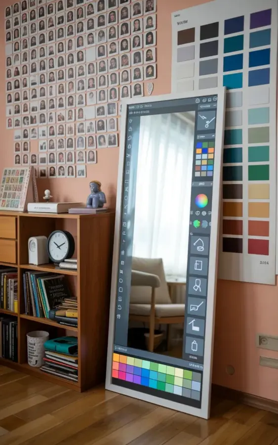
If you’re anything like me, you’ve been staring at your bedroom for weeks, convinced that a spring refresh is exactly what you need, but you have no idea where to start. Honestly, that’s how this whole corner came together. I wanted a springbedroom that felt calm and personal, not like a catalog page. And after making plenty of mistakes (and learning from them), I finally have a setup that actually works. The floor mirror with its colorful grid pattern doubles as my paint visualization tool, the gallery wall of black and white photos keeps things minimal, and that bookshelf holds my everyday favorites. But, let me be real: I messed up multiple times before it felt right. So here’s a guide to the most common bedroom makeover mistakes and how to skip them.
The Gallery Wall Mistake That Makes Your Bedroom Feel Cluttered
Look, I love a grid of small black and white photos. It’s classic, it’s personal, and it doesn’t scream for attention. But the first time I tried one? Disaster. I hung frames of different sizes at random heights and it looked like a toddler arranged them. The mistake is assuming any mix of frames works. It doesn’t. Not gonna lie, I ended up with a wall that felt chaotic rather than intentional.
Here’s the thing: keep your frames uniform. For a clean spring bedroom vibe, stick with one color (black or white) and one size. My left wall now has a perfect grid of small black frames, each holding a black and white photo. The spacing matters too. Use a level and measure exactly two inches between each frame. It sounds obsessive, but it makes the whole room feel polished. If you want variety, add one slightly larger photo at the center, but keep the border consistent. That simple change saved my gallery wall from looking like a mess.
Why Your Paint Color Palette Feels Off (And How to Fix It With a Swatch Chart)
Ok so you picked a paint color from a tiny chip at the store. You get it home, paint a swatch, and suddenly it looks like hospital mint or baby blue. That’s mistake number two: trusting those little cards. I learned this the hard way when I painted an entire accent wall a shade I thought was “sage green” but turned out to be “alarming algae.” The fix? Use a physical color swatch chart, like the one on my right wall. It has multiple squares in different shades of blue, green, and other soft tones, and it lets you see how light changes them throughout the day.
Honestly, I tape the chart right on the wall where the paint will go. I leave it for a full day. Morning light, afternoon sun, evening lamplight. Each hour shifts the color. That chart saved me from picking a too-cool blue that would have made my room feel like a freezer. And if you don’t want to commit to painting yet, you can hold up bigger swatches from the hardware store. But that wall of color squares? Total game changer. It’s not just decor; it’s a practical tool.
The Mirror Trick Nobody Tells You About (But You Need to Try)
Here’s a weird personal detail: I once used my full-length mirror as a makeshift paint palette. Not for actual paint, but I propped my tablet against it and used a design app to try color combos. And that’s exactly what my current floor mirror does. It has a white frame and a colorful grid pattern at the bottom, and when I stand in front of it, the reflection shows my phone screen displaying a paint program interface with tool icons and a palette. It’s like a cheat code for visualizing a bedroom color scheme without lifting a brush.
The common mistake? People buy a mirror, hang it, and forget it. But a floor mirror can be your design assistant. Use it as a second screen. Open a color palette app, hold up fabric swatches in front of it, or even draw a quick sketch with a dry-erase marker on the mirror’s glass (if it’s safe). The grid pattern at the bottom also helps you see symmetry in your room’s layout. I check my mirror every time I rearrange my art wall. It catches things my eyes miss, like a crooked photo or a too-bold paint decision.
Bookshelf Styling: Don’t Just Stack Books and Call It Decor
My wooden bookshelf sits against the wall, holding books, a white clock, and various small items. But the first time I styled it? All my books were lined up like soldiers. Boring. The mistake is treating a bookshelf as storage instead of a design element. For a spring bedroom makeover, you want it to feel light and curated, not packed.
Try this instead:
- Stack three to four books horizontally and place a small decorative object on top, like a ceramic bud vase or a tiny clock (mine is a white round one, nothing fancy).
- Leave empty space. I know, it feels wrong, but a negative space makes the items you keep feel more intentional. One shelf can hold just a single plant and a candle.
- Mix vertical and horizontal book arrangements. Some standing, some stacked. It breaks the rhythm and looks more like a real person lives there, not a showroom.
- Add a personal touch that isn’t a book. That white clock is from a thrift store and it keeps terrible time. But I love it. It gives the shelf personality.
And whatever you do, don’t cram every inch. Your bookshelf should breathe a little. Especially in a spring bedroom, you want that airy, fresh feeling.
Using Digital Tools to Test Colors Before You Commit (It’s Not Cheating)
Let’s talk about the paint interface on my mirror. I use a free app (there are dozens) that lets me upload a photo of my room and paint virtual swatches on the walls. The mistake? People either ignore digital tools entirely or they use them once and think that’s enough. But here’s the thing: the app is only good if you also check colors in real life. Trust me, I tried picking a color purely from my phone and ended up with a lavender that looked like dish soap in natural light.
So here’s my routine. I take a photo of my bedroom (with the art wall, bookshelf, and mirror in frame). Then I load the app and try five or six paint colors, saving screenshots. Then I go to the hardware store and grab real paint chips for the shades I liked best. I tape those chips onto my wall for a day. The digital tool helps me narrow down options fast, but the real swatch is the final gatekeeper. This combo saved me from at least two bad paint decisions last year. And it’s honestly fun. You can play with color combinations like a game before you ever buy a paint can.
The Biggest Mistake of All: Rushing the Whole Spring Bedroom Makeover
I know you want a finished room in one weekend. I’ve been there. But that mindset leads to throwing up the first art wall you see on Pinterest and buying paint that “looks close enough.” Slow down. My corner came together over three weeks. I hung the gallery wall first, lived with it, then added the bookshelf, then the mirror, then the color swatch chart. Moving piece by piece let me see what the room needed.
Not gonna lie, I once painted a room in a single afternoon and regretted it for a year. The color was too dark and clashed with my rug. If I had waited, I would have noticed the rug’s green undertones. Spring bedrooms are about renewal, not a frantic makeover. Give yourself permission to change one thing per week. Start with the art wall. Then experiment with paint colors using the swatch chart. Then bring in the mirror. It’s more satisfying, I promise. And you’ll avoid that buyer’s remorse that comes with rushed decor.
Anyway, those are the mistakes I keep making. But now my bedroom corner finally feels like me. The photos, the books, the mirror that doubles as a design tool, all of it works together because I took the time to get the details right. If you’re planning your own spring bedroom refresh, start with one wall. Make it your art wall. Pick a paint palette that makes you breathe a little deeper. And use that mirror to see the whole picture.
Have your own makeover mistake story? Or a paint color that surprised you? I’d honestly love to hear it. Drop a comment below or send me a message. Let’s make this spring the season your bedroom finally feels complete.
#springbedroom #bedroommakeover #artwall #paintcolorinspiration #diybedroomdecor
Leave a Comment