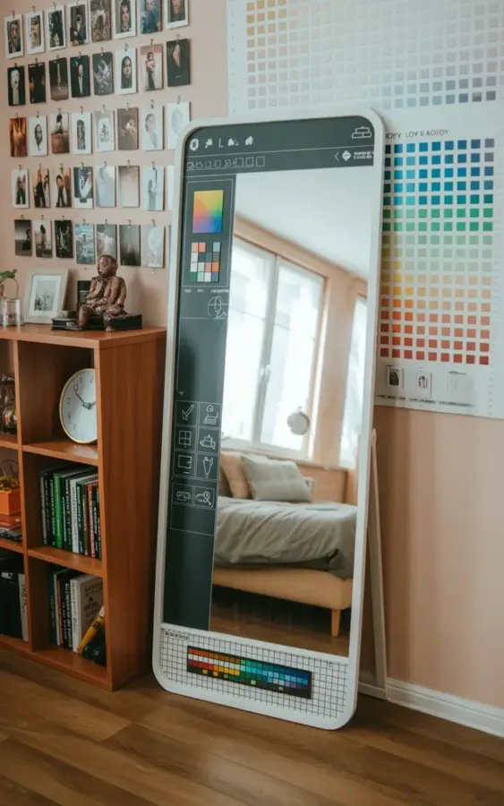
Honestly, I didn’t expect to love a floor mirror this much. But when I saw this setup with the colorful grid at the bottom mimicking a paint program interface, something clicked. It’s spring season, and the urge to refresh your bedroom without ripping out furniture is real. This whole idea turns a plain floor mirror into a creative mood board that actually sparks ideas instead of just reflecting your tired morning face. And the best part? You don’t need to be a designer or even that patient.
Why your floor mirror needs a paint palette makeover this season
Look, a standard floor mirror is fine. It does its job. But here’s the thing, your bedroom decor can feel flat if every surface is just functional. The paint palette approach adds color at the bottom of the mirror, like a digital toolbar you’d see in a drawing app. It creates a focal point low down, which draws the eye around the room instead of letting it get stuck on the empty wall. For a seasonal refresh (I’m doing this for late spring into summer), that pop of color at mirror-level feels playful but not childish. I painted mine with acrylics on a removable grid, so I can swap the palette when I get bored. Takes an afternoon, maybe less if you skip lunch.
How to build a color swatch wall that actually works with your mirror
Over on the right side of the photo, there’s a color swatch chart with squares in shades of blue, green, and a few other hues. It’s not random. That swatch wall picks up the colors from the paint palette on the mirror. So the whole room feels connected without matching. Here’s a practical tip: use paint sample cards from a hardware store. Stick them in a grid with washi tape so you can rearrange them monthly. I used double-sided tape that doesn’t peel the paint off my rental walls, landlord approved. The key is to keep the swatches close in tone but varied enough to create visual rhythm. Too many neon colors and it’ll scream preschool. Too few and it’s boring.
Actually, let me rant for a second about color swatch walls. People overthink them. They buy expensive framed swatches or order custom fabric squares. No. Just tape up the free fliers from the paint aisle. It’s a mood board, not a museum exhibit. Anyway.
Balancing a black-and-white photo gallery on the opposite wall
The left wall in the image is covered with a grid of small black and white photographs. That’s your anchor. Color on one side (the swatch wall), color on the mirror bottom, but then a clean black-and-white gallery on the other side. It stops the room from looking like a crayon box exploded. Use thin black frames or clip frames. Mount them in a tight grid, not a scattered organic layout, that’ll compete with the paint palette’s structured interface look. I printed my photos at a local drugstore for cheap. One of them is a weird close-up of my cat’s nose, and honestly, it works. You don’t need fine art. You need contrast.
Designing the paint program interface on your mirror without losing your mind
Ok so the mirror in the photo has a white frame and a colorful grid at the bottom that looks exactly like a paint tool palette. Think Photoshop toolbar but simplified: a brush icon, a paint bucket, a color picker swatch. You can recreate this with vinyl decals cut into tiny shapes, or draw directly with dry-erase markers if your mirror has a smooth surface. I went with peel-and-stick vinyl because I’m clumsy with paint near glass. Make the grid about 6 inches tall across the entire bottom edge. Use three to five colors plus white and black. That’s enough for inspiration without turning your mirror into a toddler’s tablet screen. And leave space for your reflection, you need to see your outfit.
The wooden bookshelf adds more texture than you’d think
Notice the wooden bookshelf against the wall in the photo. It’s not just there for storage. That natural wood grain breaks up all the geometric grids (photo grid, swatch grid, paint grid). A white clock sits on it, plus books and a small decorative item. I’d recommend a warm wood tone, like oak or walnut, to offset the cool blue-green tones on the swatch wall. The bookshelf also gives you a place to put a real paintbrush or a tiny pot of gold paint, little playful touches that echo the paint palette theme without being on the nose. If you don’t have a bookshelf, a simple wooden crate on the floor works. The texture matters more than the piece itself.
Quick customization ideas for your paint palette mood board mirror
- Use magnetic paint behind the mirror frame so you can swap out tiny magnetized color swatches weekly. (I tried this, and the magnets kept sliding off. Better to stick with vinyl.)
- Add a single line of white fairy lights along the bottom edge of the mirror. They’ll illuminate the paint palette at night and make the bedroom feel cozy without being a full string-light trellis situation from a college dorm.
- Change the grid colors with the season: pastels for spring, earthy browns for fall, icy blues for winter. Just peel off and restick.
- Incorporate a small dry-erase section on the mirror glass above the grid, where you can jot down paint names or decor ideas. Use a fine-tip whiteboard marker. Trust me, it beats a sticky note.
- If you’re brave, paint the floor mirror frame itself in one of the swatch wall colors. But keep the grid colors separate, don’t let the frame compete with the interface design.
One thing I learned the hard way: don’t use permanent markers on the mirror if you rent. A friend did that and had to repaint the entire frame to cover the stain. Use temporary materials. Your deposit will thank you.
Pulling it all together for a balanced boudoir vibe
So you’ve got the floor mirror with its paint palette bottom, the color swatch wall on the right, the black-and-white photo gallery on the left, and the wooden bookshelf anchoring the space. It sounds like a lot. But in practice, it’s a balanced triangle of visual weight. The mirror is the centerpiece, the swatches provide color direction, and the photos give you a quiet place to rest your eyes. I walk into this setup and immediately feel more creative. Not gonna lie, I’ve started sketching room ideas on my phone just from staring at the grid. That’s the point, it’s a mood board you can stand on, not a Pinterest folder you’ll never open again.
Anyway, if you’re craving a quick bedroom refresh without buying new furniture or repainting whole walls, this DIY is the move. Save this idea for your next room update, grab some paint samples and a vinyl cutter, and give your floor mirror a second life. It’s low risk, high reward, and frankly, way more interesting than another throw blanket.
#floor mirror #paint palette #bedroom decor #color swatch #mood board
Leave a Comment