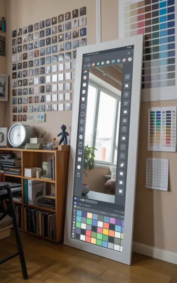
The photo that inspired this post is a perfect example of what I mean when I tell people you can redecorate a bedroom for under fifty bucks. Look at that space: a grid of black and white photos dominating one wall, a wild floor mirror leaning against another, and a jumble of paint swatches arranged like a giant piece of abstract art. It’s a budget bedroom decor idea that doesn’t look cheap, it looks intentional. And the best part? Almost everything in that room came from a hardware store or a printer. This is not about buying a whole new bedroom set. Let me show you exactly how to pull this off in your own space, step by step.
## Step 1: Build Your Black and White Photo Grid Wall
The photo grid is doing a ton of heavy lifting in that picture, and it costs almost nothing if you play your cards right. I’m talking about printing regular old 4×6 photos, the kind you’d normally toss in a drawer, and turning them into a gallery wall. Black and white is the secret because it looks cohesive even if you’re using random shots of your dog, your friend’s birthday, or that weird tree you saw on vacation.
Printing photos is dirt cheap. You can upload them at any drugstore or online printer for about a dime each, or just use a home printer on plain paper if you’re really pinching pennies. Here’s the thing though, the frames are what usually break the budget. So skip the frames entirely. Use washi tape or binder clips to hang the photos directly on the wall. Or, grab a pack of cheap wooden frames from a craft store and spray paint them all one color, like matte black or white. In the reference photo, the photos are small and uniform, which creates that clean, gallery-like rhythm on the wall.
– Use 4×6 prints for a uniform look, no larger.
– Keep the spacing consistent, about two inches apart.
– Plan the grid on the floor first before you hammer any nails into the wall. Seriously, just tape the photos to the floor in a grid and measure from there. It saves you a ton of headache.
– Mix in one or two personal items, like a postcard or a pressed flower, if the grid feels too rigid. But honestly, the black and white photos work best when they’re all the same type of print.
## Step 2: Make a Paint Swatch Wall for Near Zero Cost
Ok so the paint swatch wall is the part of this that made me actually laugh out loud when I saw it, because it’s so clever and so absurd at the same time. You know those free paint strips you grab at the hardware store to decide on wall colors? That pile of cardboard you normally shove into your purse and forget about. That’s literally the art. In the photo, the swatches are arranged in a massive grid on the right side of the wall, creating a color-blocked installation that looks like a modern art piece.
You don’t need to buy anything. Walk into a hardware store, pick up a few dozen paint swatch cards in the colors you love, and walk right back out. Nobody will stop you. Find shades of blue, dusty green, terracotta, or whatever palette makes your brain happy. Arrange them on the wall in a grid, or stagger them if you’re feeling rebellious, and just stick them up with double-sided tape or mini clothespins on string.
Here’s a tip that nobody tells you: choose one dominant color family and then add a few wildcard shades. In the photo, the swatches are mostly cool tones like blues and greens, with a few pops of other colors mixed in. That’s what keeps it from looking like a messy collage. It also makes the room feel pulled together. And if you decide you hate the color arrangement, you can rearrange the whole grid in two minutes because it’s just tape. There’s no commitment, which is honestly my favorite part of this entire project.
## Step 3: Let the Floor Mirror Be the Wild Card
Now let’s talk about that mirror. It’s a big, leaning floor mirror with a white frame, and it has this graphic, colorful grid pattern running along the bottom edge. This is the piece that makes the whole room feel expensive. But here’s the thing, you don’t need a custom mirror with a funky pattern to get this effect, you just need to paint it yourself. Get a basic used mirror from Facebook Marketplace or a thrift store for like ten bucks, lean it against the wall, and paint a colorful geometric pattern directly onto the frame.
I would definitely paint the frame a deep, matte color and then add your own grid with painter’s tape. Or, leave the frame plain and just lean it against the wall next to the paint swatches. The mirror is also a huge practical win for a small bedroom because it bounces light around the room, making the space feel double the size. In the photo, you can see the mirror is reflecting a computer screen showing some kind of design program with a color palette, which is a weirdly specific detail that honestly makes it look even cooler. It’s like the mirror is part of the creative process.
## Step 4: Style a Bookshelf That Feels Cozy, Not Cluttered
The wooden bookshelf in that corner is the anchor of the room. It’s what keeps the photo wall and the paint swatch wall from feeling like they’re floating in space. You don’t need a fancy, built-in library wall to get this vibe, a basic cube shelf or a secondhand bookcase works just fine. The key is to not overload it with stuff. In the photo, the shelf has books, a white clock, and a few small trinkets. That’s it.
It’s so easy to just stuff bookshelf with every novel you own and call it a day, but that creates visual chaos. Instead, treat it like a display, not storage. Stack some books horizontally, stand a few vertically, and leave some empty space on the shelves. The white clock is a nice touch because it breaks up the brown wood and adds a functional element. Honestly, just take a look at your own bookshelf right now and ask yourself if it looks like a museum display or a recycling bin. The goal is the former.
## Step 5: Tie It All Together Without Hitting the Mall
Here’s the part where you can actually start adding personality without spending any real money. The room in the photo has a specific, cozy feel because everything is grounded by natural materials and neutral furniture. The wood of the bookshelf, the white frame of the mirror, and the black and white photos all balance out the crazy color explosion of the paint swatches.
If you’re worried about the paint swatches looking too DIY, take a step back and remember that DIY is the entire point. You’re not trying to fool anyone into thinking you spent a grand at an upscale furniture store. You’re making a statement that says, “I have good taste and zero budget, and I’m proud of it.” That’s a vibe. And honestly, a room like this is way more interesting to look at than a catalog showroom because it tells a story. The story is just “I love free stuff and I’m creative,” which is a pretty great story to tell.
One thing I will say is to be careful with the lighting. A single harsh ceiling light will kill this warm, cozy mood. Add a warm-toned floor lamp or even a string of fairy lights draped around the mirror. In the photo, the natural light from the window is doing most of the work. If you don’t have great natural light, you have to fake it with warm bulbs. Nobody likes staring at a bright white LED in the middle of winter. It’s clinical and weird.
## Step 6: The Free Art Upgrade That Works Every Time
Let me leave you with one more thought about the paint swatch wall. It sounds crazy to put free cardboard samples of paint on your wall, but it works because of the repetition. One swatch is junk mail. Twenty swatches arranged in a perfect grid is exhibit-worthy. There’s something deeply satisfying about a DIY project that costs literally zero dollars and looks like it took hours of planning. I mean, it does take about an hour of planning to get the spacing right, but the materials cost is nothing.
The same rule applies to the photo wall. If you just pin up three random photos, it’s meaningless. But when you commit to a full grid of like twelve or twenty images, it becomes a focal piece. The pattern is what sells it. So if you try this, commit to the grid. Don’t half-ass it. Go big or go home, as they say. Go to the hardware store and grab every swatch card in the blue and green family. Lay them all out on the floor and arrange them like a puzzle. And when you finally stand back and look at your new bedroom wall, I promise you’ll wonder why you ever bought an overpriced canvas print from a big box store.
This whole budget bedroom makeover is a lesson in restraint and creativity. You’re using materials that were meant to be free or discarded and treating them like precious objects. The mirror adds light, the photos add memory, the swatches add color, and the bookshelf adds warmth. It’s a balanced ecosystem. So, which part of this would you actually try in your own room? I’d love to hear if you tackle the paint swatch grid or if you’re more into the black and white photo wall. Drop a comment and let me know how it turns out. Now go make a mess and take some pictures of it for the internet.
Leave a Comment